-
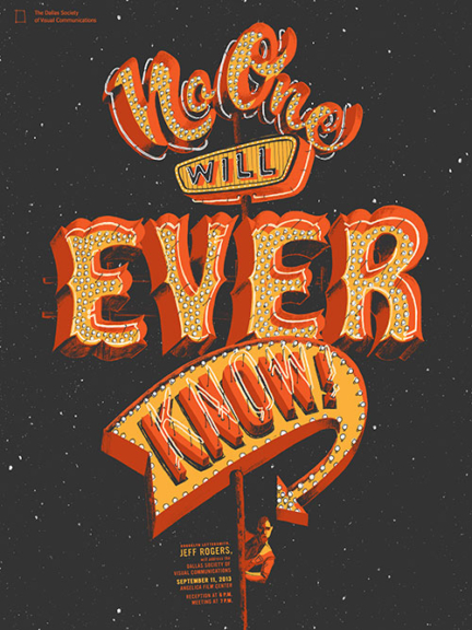
No One Will Ever Know
SIGN An interesting logo going back to the roots -
NYC
SIGN This is a great overhead A4 psd mock-up to showcase all your letterhead -
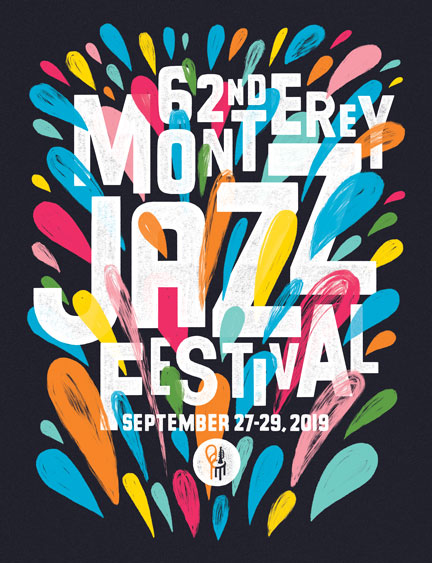
Monterey Jazz Festival
Big, Campaign ••• The Monterey Jazz Festival is an annual music festival that takes place in Monterey, ... -
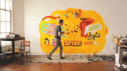
McDonalds
Big, MOTION, PAINT JTNDaWZyYW1lJTIwc3JjJTNEJTIyaHR0cHMlM0ElMkYlMkZwbGF5ZXIudmltZW8uY29tJTJGdmlkZW8lMkY1NTQ2MTA0NSUzRnRpdGxlJTNEMCUyNmJ5bGluZSUzRDAlMjZwb3J0cmFpdCUzRDAlMjIlMjB3aWR0aCUzRCUyMjY0MCUyMiUyMGhlaWdodCUzRCUyMjM2MCUyMiUyMGZyYW1lYm9yZGVyJTNEJTIyMCUyMiUyMHdlYmtpdGFsbG93ZnVsbHNjcmVlbiUyMG1vemFsbG93ZnVsbHNjcmVlbiUyMGFsbG93ZnVsbHNjcmVlbiUzRSUzQyUyRmlmcmFtZSUzRQ==For a designer used to drawing pictures at a desk, painting and acting in ... -
Blue Q
PAINT ••• For a collaboration between SpotCo and Blue Q, I made a series of paintings ... -
New York Times
COVER, EDITORIAL, SIGN Simple project case with a flurry stain of grunge types -
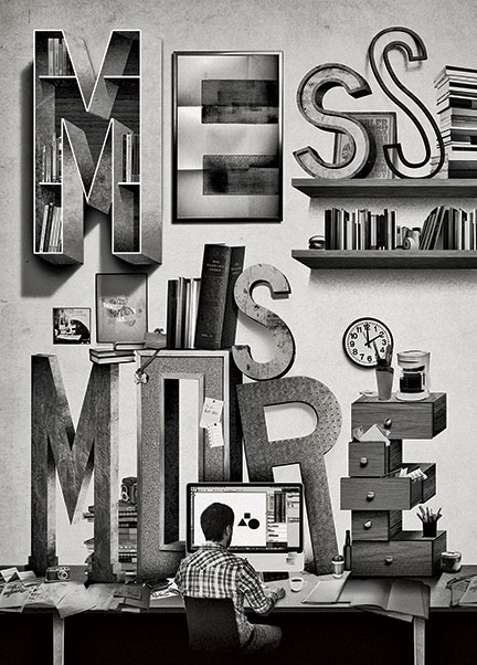
Mess Is More
EDITORIAL The amazing bring-back bag with all you ever need inside -
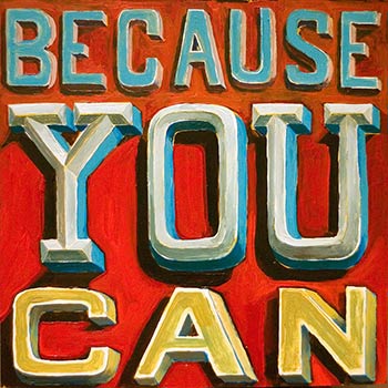
Because You Can
EDITORIAL, PAINT An interesting example of how an apple juice should be packaged -

Wells Fargo
Campaign, MOTION An old and wretched bookmark -
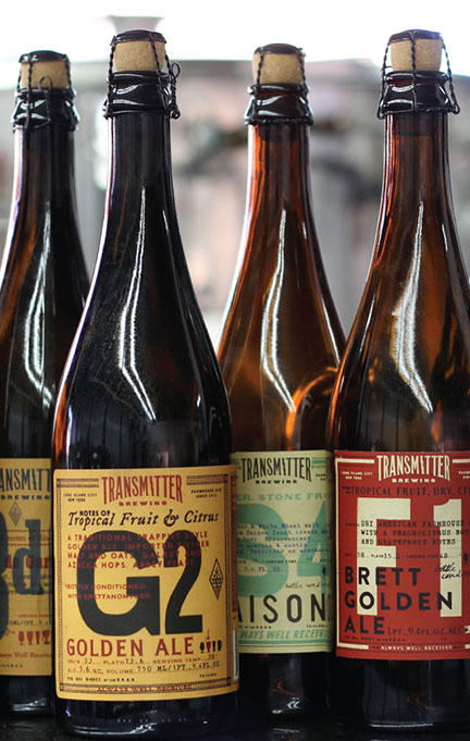
Transmitter Brewing
DESIGN The all-in-one Mapple PC solution available now for only $99c -
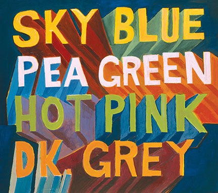
Type Lockups
DESIGN ••• A veritable smorgasbord of type and lettering. ... -
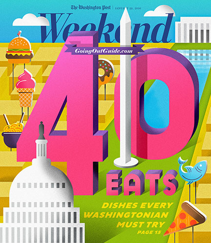
Washington Post
COVER, EDITORIAL ••• For the 40th annual “DC EATS” issue, I was asked to bring some of ... -
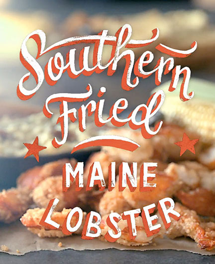
Joe’s Crab Shack
Campaign, PAINT ••• My pal Dan Cassaro asked me to work with him to create some painted ... -
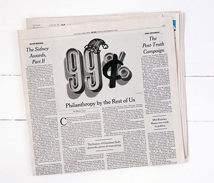
New York Times Op Ed
EDITORIAL ••• During the height of the Occupy Movement in 2011, Olivier Zunz wrote an Op-Ed ... -
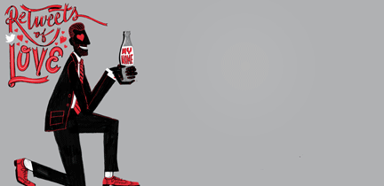
Diet Coke
Campaign, MOTION ••• Tweets from Diet Coke fans were taken to the next level through typographic illustrations ... -
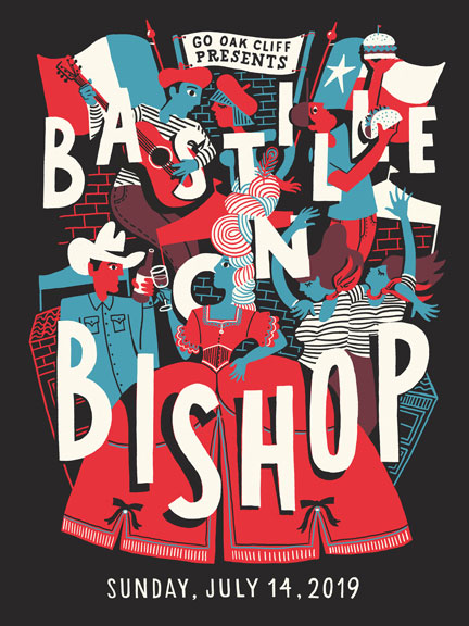
Bastille on Bishop 2019
Campaign, DESIGN ••• Bastille on Bishop is An annual festival in the heart of the Bishop Arts ... -
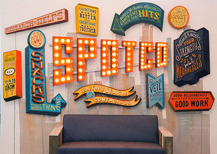
SPOTCO Installation
Big, PAINT ••• Taking cues from the values and culture of NYC advertising agency SpotCo, I created ... -
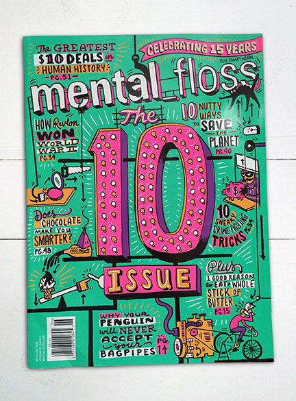
Mental Floss
COVER, EDITORIAL, SIGN ••• A challenging but rewarding brief: create an illustration of a Rube Golberg-like contraption that ... -
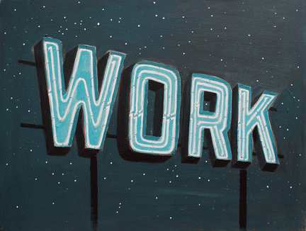
Work/Life 2
COVER, PAINT ••• For the third volume of Work/Life, a curated directory of illustration, I wanted to ... -
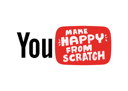
YouTube
Campaign, MOTION ••• I worked closely with the talented team at CoCollective to create marks that expressed ... -
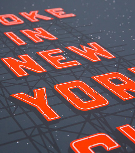
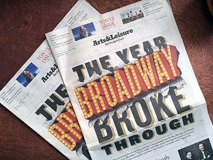
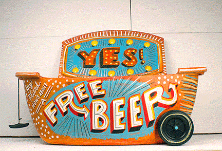
Broke In New York City
SIGN ••• Gig poster for The Lone Bellow's performance at Carnegie Hall. The poster features a ... -
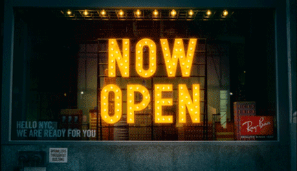
Ray-Ban
Campaign, MOTION, SIGN ••• To announce the launch of Ray-Ban's first flagship store in NYC, I worked with Marcel ... -
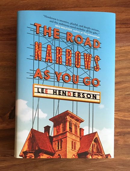
Penguin
COVER, SIGN ••• Lee Henderson's novel is a portrait of a young, enthusiastic comic artist trying to ... -
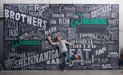
Wahlburgers
Big, PAINT ••• I got to ride a train up to Boston to create this Wahl of ... -
Chipotle Mural
Big ••• I was asked to create a large mural to be used for a fun ... -
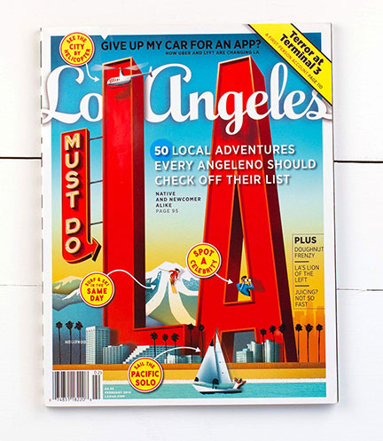
Los Angeles magazine
COVER, EDITORIAL, SIGN ••• What a fun and epic challenge it was to figure out a way to ... -
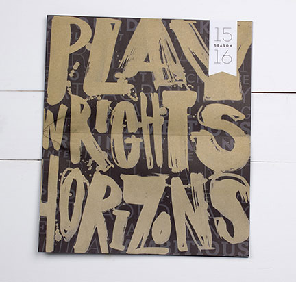
Playwrights Horizons
DESIGN, PAINT ••• Playwright's Horizons is a writer's theater in NYC dedicated to the support and development ... -
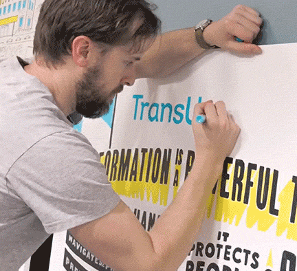
Transunion Mural
Big, PAINT ••• For the launch of Transunion's new branding, Avenue hired me to create a large piece ... -
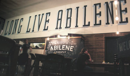
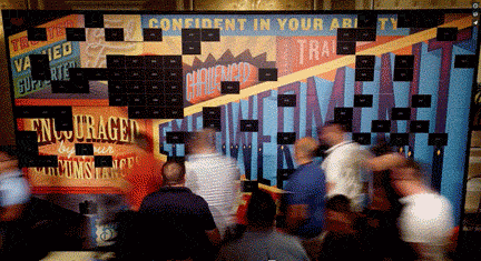
Abi-Haus
Big, DESIGN, PAINT This project was awarded a spot in the Type Directors Club Annual in 2013 (TYPOGRAPHY ... -
Leinenkugel’s Canooler
PAINT JTNDaWZyYW1lJTIwc3JjJTNEJTIyaHR0cHMlM0ElMkYlMkZwbGF5ZXIudmltZW8uY29tJTJGdmlkZW8lMkYxMzE4ODY1MzUlM0Z0aXRsZSUzRDAlMjZieWxpbmUlM0QwJTI2cG9ydHJhaXQlM0QwJTIyJTIwd2lkdGglM0QlMjI2NDAlMjIlMjBoZWlnaHQlM0QlMjIzNjAlMjIlMjBmcmFtZWJvcmRlciUzRCUyMjAlMjIlMjB3ZWJraXRhbGxvd2Z1bGxzY3JlZW4lMjBtb3phbGxvd2Z1bGxzY3JlZW4lMjBhbGxvd2Z1bGxzY3JlZW4lM0UlM0MlMkZpZnJhbWUlM0U= ••• A couple other artists and I were commissioned to create custom Canoolers to help raise ... -
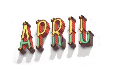
April
EDITORIAL, SIGN ••• For this headline, I wanted to combine the color and energy of spring with ... -
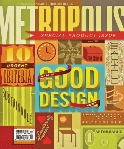
Metropolis
COVER, EDITORIAL ••• SpotCo’s design team was asked to create the cover for Metropolis Magazine’s special product ... -
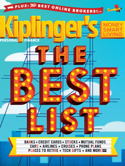
Kiplinger’s magazine
COVER, EDITORIAL, SIGN ••• I had a lot of fun digging in and creating SO many sign illustrations ... -
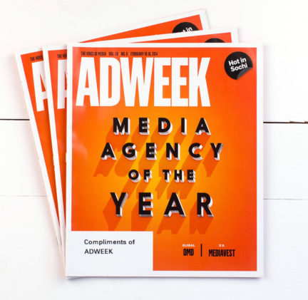
Ad Week
COVER, EDITORIAL ••• I worked with the team at Adweek to create a unique typographic style for ... -
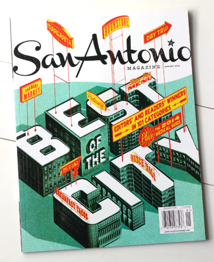
San Antonio magazine
COVER, EDITORIAL, SIGN In a blue world of gadgets, this powerful notebook rules them all -
Enbridge
SIGN The American Eagle Society asked us to deliver a bold logo and we did